Evolution of Android’s Visual Identity
Android has been on a continuous path of refinement, enhancing user experience with each iteration. One of the notable visual trends introduced in Android 16 was the incorporation of translucency in the notification shade and Quick Settings. This feature not only added a layer of sophistication but also paved the way for further aesthetic advancements.
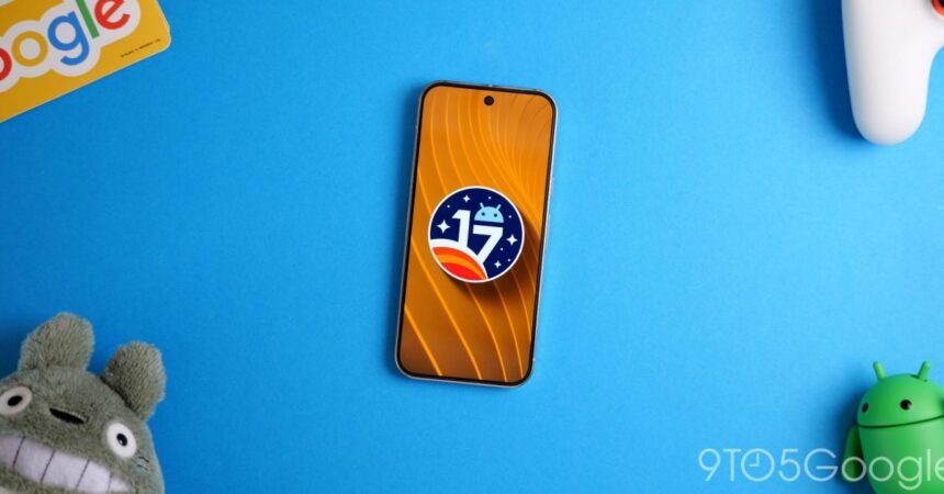
As the latest development, Android 17 Beta 3 expands upon this visual foundation by introducing more blur effects to the system UI. This design choice aims to create a more cohesive and immersive experience for users, blending the boundaries between different UI elements.
Key Enhancements in Android 17 Beta 3
- The background of the widget picker now features a blur effect, transitioning from its previous opaque state. This change contributes to a more streamlined look and feel across the system.
- Enhanced blur effects are also applied to other parts of the system UI, further emphasizing the theme of depth and layering in the interface.
These updates underscore Google’s commitment to refining the Android experience, making it not just functional but also visually appealing. By gradually introducing such design elements, Android aims to set a new standard for mobile operating systems in terms of aesthetics and user engagement.
For developers and enthusiasts, these beta releases provide valuable insights into the future of Android, allowing them to prepare and adapt their applications to seamlessly integrate with the evolving platform.